Co-designing a community platform with a cause
LOCAL AUTHORITY | CIVIC | COMMUNITY
When the chief executive of Barking and Dagenham Giving came to us in 2020 with their vision to co-design the brand identity for the B&D Giving platform, with everyone who has a stake in the borough to contribute, we knew we had to go out and do exactly that. Give local residents a central role in putting a face to the platform.
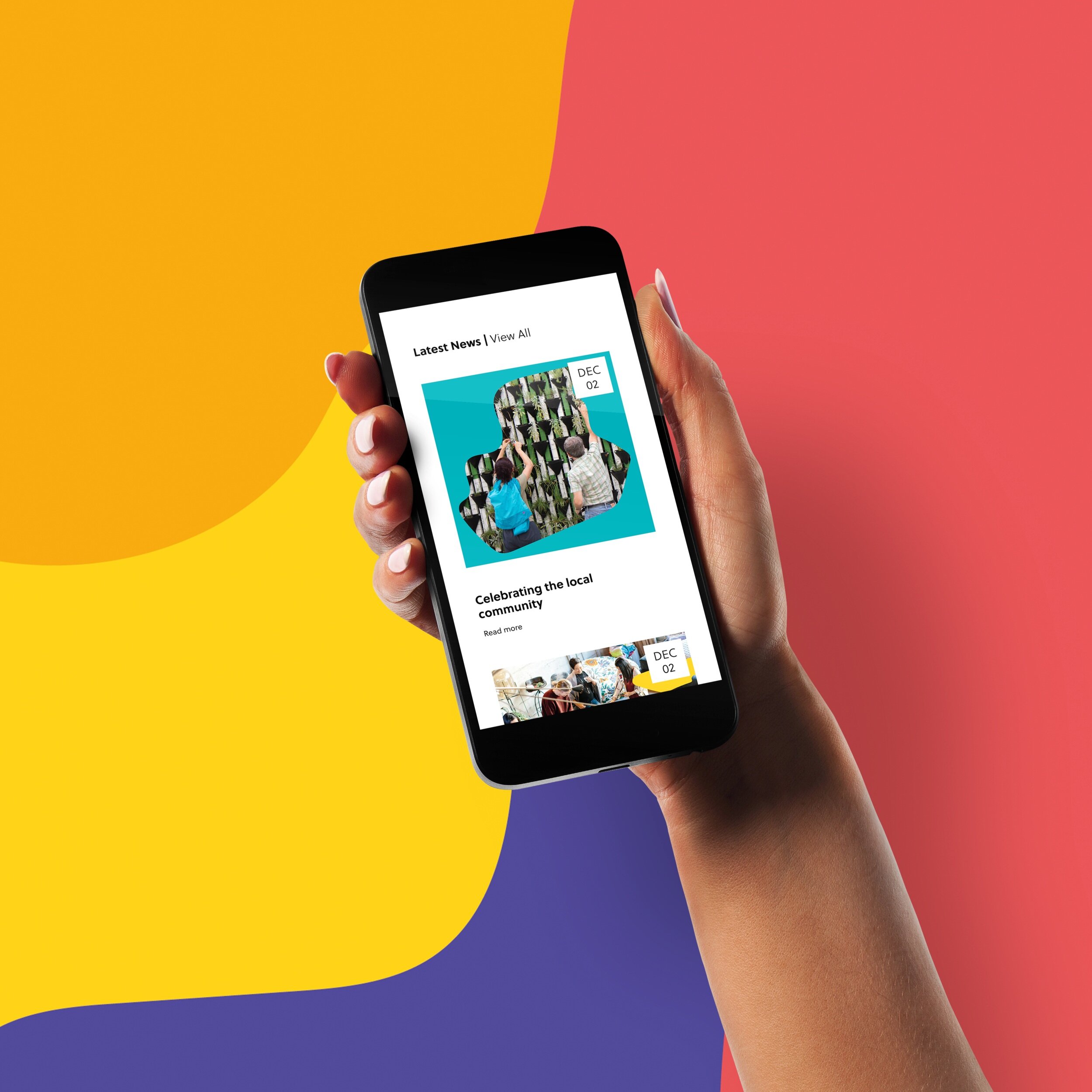
Working closely with their team and local residents who volunteered to be involved, we set out to distinguish Barking & Dagenham Giving as the place for local voices to be heard in an established local authority landscape. The outcome? A co-designed visual identity, user-friendly website and social assets that clearly articulates the platforms collaborative, inclusive and ambitious nature.
CLIENT
INDUSTRY
Local Authority / Civic / Community
SERVICES
Research / Branding / Web / Content
From initial workshops we started to develop our brand strategy that elevates the boroughs 5 priority areas Participation, Collaboration, Learning, Organisation and Listening which helped lay down the foundations for strong visual expression.
Research / Discovery
We met Barking & Dagenham Giving after extensive research and ground work which included one-to-one interviews with local residents and grantees who were known to the platform. This revealed a desire involvement in key-decision making and the development of the platform identity. We learned that we needed to prioritise inclusivity and collaboration in every aspect of the process to gain trust.
Visual Identity
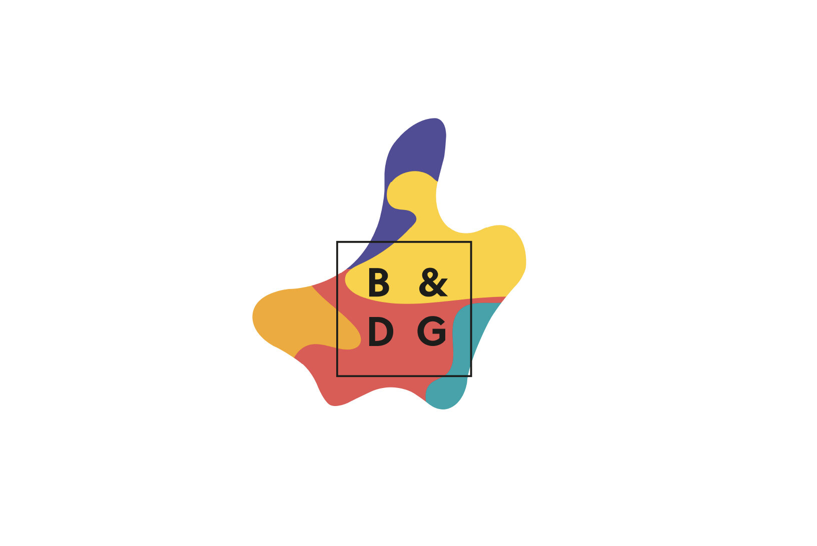
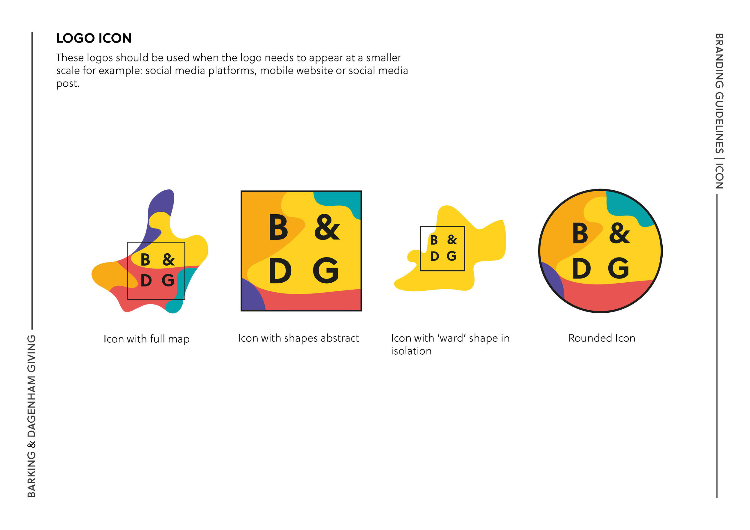
Inspired by the borough, we created an icon of the borough of Barking and Dagenham with blended districts to reflect the collaborative and inclusive nature of the platform.
Colour Palette
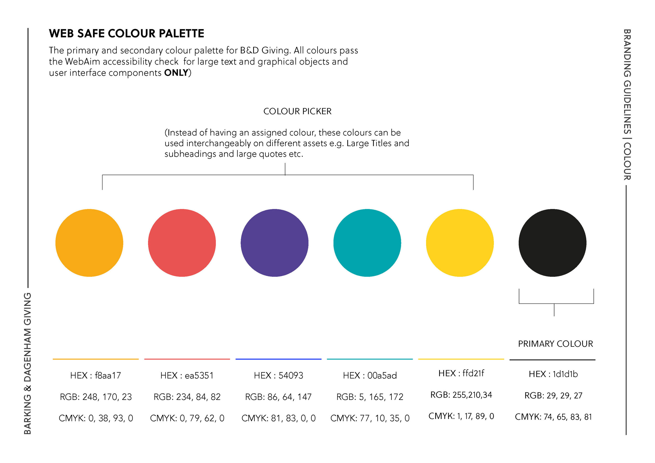
A diverse, bold and vibrant colour palette to represent the borough and its 5 priority areas of Participation, Collaboration, Learning, Organisation and Listening.
Branding Guidelines.
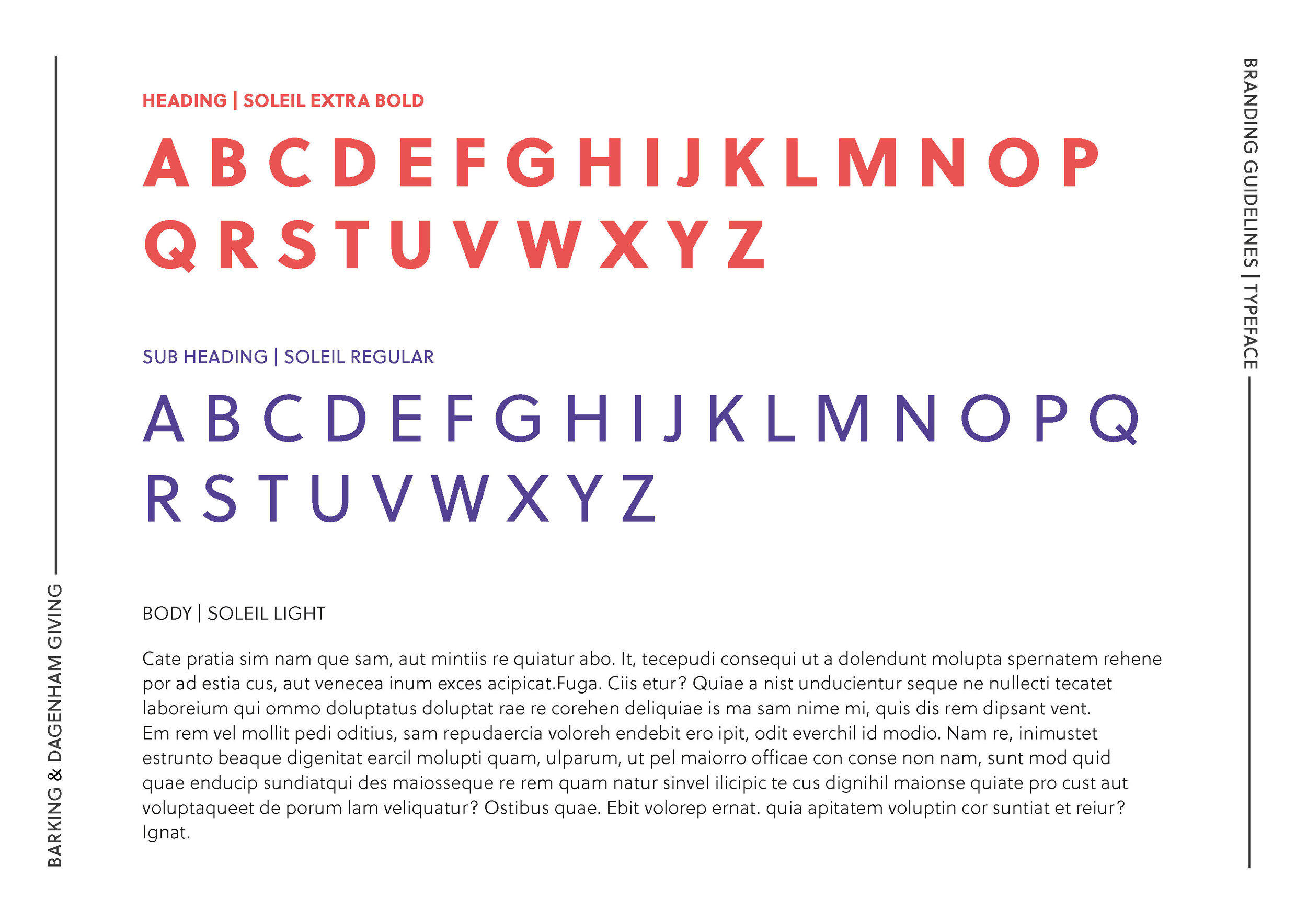
Our next step? A brand guide, complete with best practices for designing print and digital assets. The comprehensive toolkit ensures that both internal and external team members can easily generate consistent and compelling communications.


District Icons
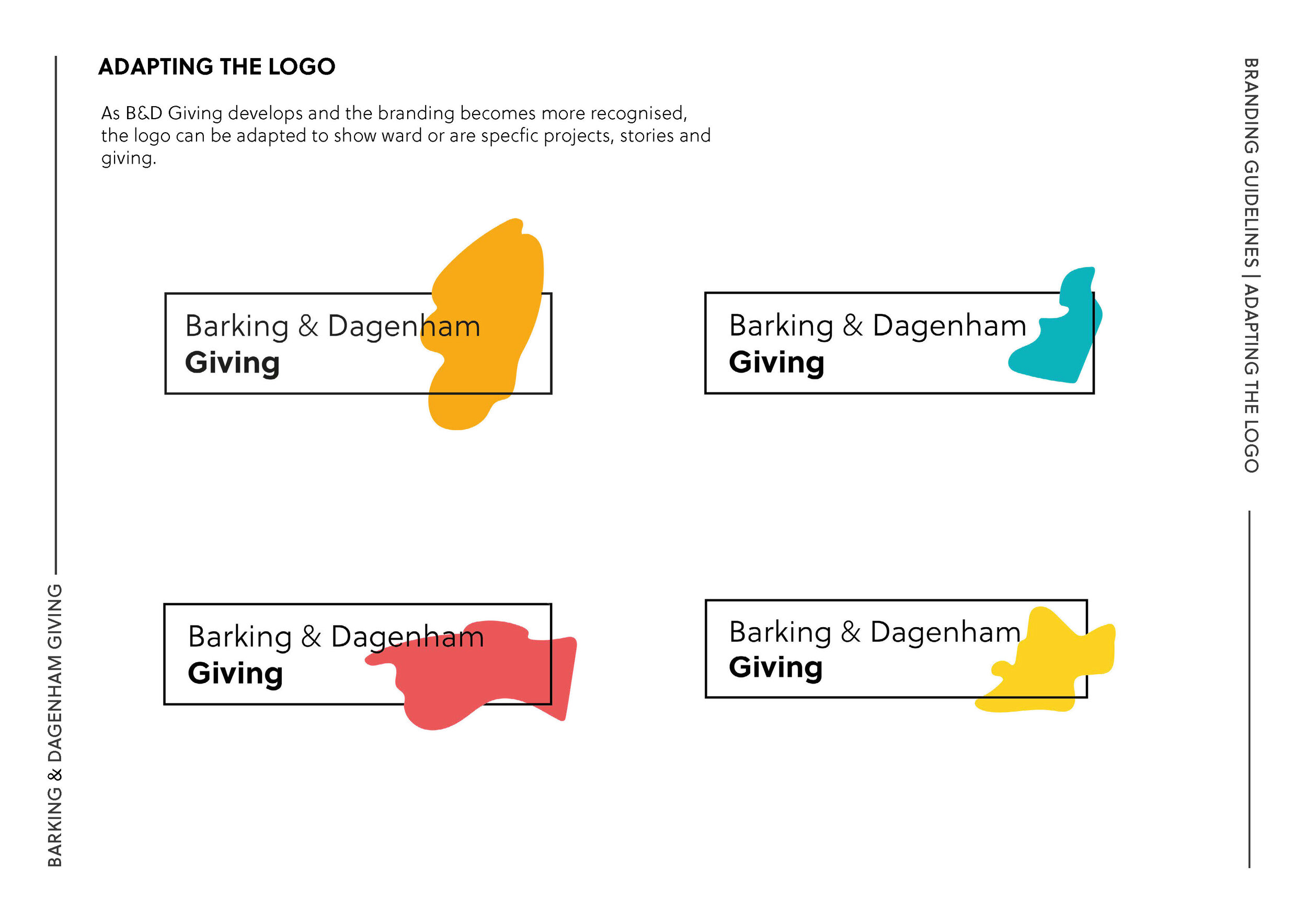
These shapes represent the different areas that make up Barking & Dagenham. However, as they are abstracted versions they can be used as visual components across different assets.
Brand Implementation
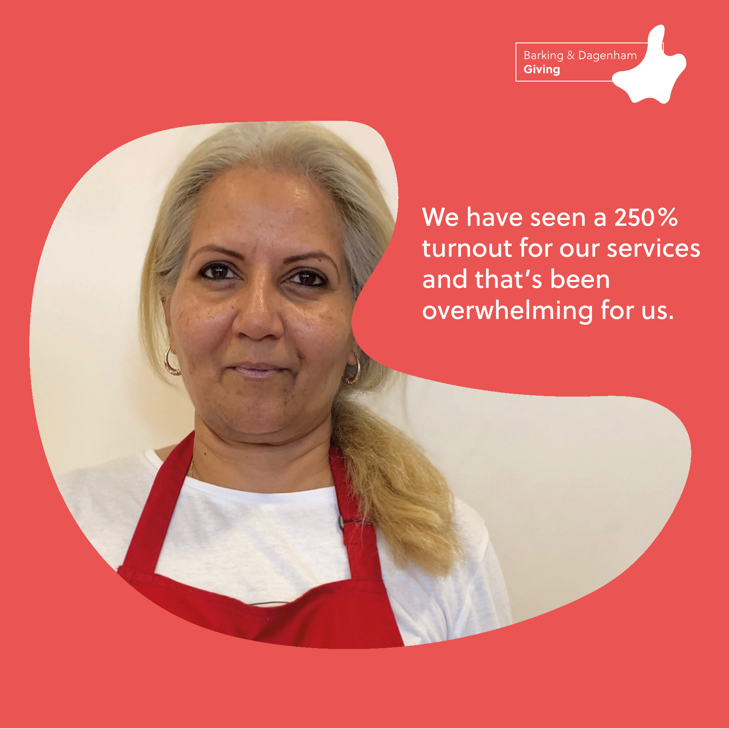
The community are all involved in bringing their ideas, energy and resources to the platform so we found ways to introduce elements of personalisation from certificates, funded by logos to social content for residents to share their stories across the platform.


